Seriously, though, Comic Sans was originally designed to be legible at the smallest possible font size, and the lack of hard lines makes it easier to read!
I…don’t hate it? Why am I not horribly offended by this?
Same thoughts here. Went in expecting to hate it instantly and found that it sort of looked nice.
This has me rethinking like two decades of coding. wtf.
I think some of the reason might be that Comic sans used to have really bad kerning. But with a mono font it is not really an issue.
Yeah, this has me intrigued. May try it out in vscode just for a lark. Possibly actually will be easier to read with some nice shapes…
I feel the same way. I hate that Iike it and am now going to try it.
Oh no, I was ready to pick up my pitchfork, but that is super legible. Brb, I need to go take a look at myself in the mirror…
Definitely makes sense considering some dyslexic people have found it helpful in terms of legibility
Yep, it shares a lot of characteristics with fonts like Dyslexie, but without some of the more irritating (but helpful) gravity additions that throw off non-dyslexic readers and/or just look odd.
I came here to get mad but comic sans monospaced looks really good. I’m impressed. I might switch my IDE to this.
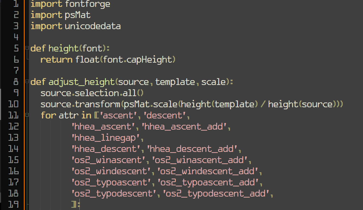
Yeah but does it have ligatures? That’s my hard pass on coding fonts.
Looks to me like it has a ligature that visually appears as two separate characters but are spaced to be close together. See the
<=in the code examples on the page.
Reducing the font-size makes it look pretty great.
This looks way better than it has any right to, I expected to hate this. Now I’m looking at fonts again reevaluating some shit
First of all, how dare you
Second of all, how dare you
Third of all, at least it isn’t papyrus
Papyrus!!!
I didn’t want to wake up and start liking comic sans, God damn
I mean Comic Mono is mentally relaxing and legible so great font of choice
⚠️ I have reported this post to the proper authorities.
Title is misleading, it’s a monospaced derivative of Comic Sans that’s actually nice, not actual Conic Sans.
Conic Sans is the hyperbolic version of Comic Sans
I miss RES’s context feature now. Thank god this thread wasn’t too long, so I was able to find my comment you replied to in it in a reasonable amount of time.
Friendship ended with font gatekeeping and dogpiling, accessibility is my new best friend
Wow, poor comic sans didn’t deserve all the hate it got
Oh no now I want to build a whole Arch rice around that font.
…no that’s not enough.
we need ComicSansOS
Holy man! If you ever do that. Please post! On unix porn as well!
I used to use Ubuntu mono but now I use Jetbrains Mono but damn that comic sans looks better than I’d expect I might even give it a try!
If you like that, check out Recursive Sans & Mono
I wouldn’t pick it over Fira Code but it has a bit of whimsy to it that reminds me of Comic Mono.
*Really * dig that for a new-wave ui
Ooh, I like that.
That is so cool. I have no idea what to use it for but I just spent 10 minutes playing with the sliders.
This is cute~! I hated comic-sans when seeing it on lots of tacky corporate and school signs etc. but recently I ironically and then unironically fell in love with its whacky-ness, bold-ness and readability, (I use a Samsung phone, and used PT Mono on the S9, but then future phones blocked custom fonts, so I used one hack-ey Comic-Sans version since my mono ones are so underground no one developed a phone hack - now any font is possible again so I’m using the one below~ )
A few years ago my fav. font became PT Mono, from Google Fonts - cyrilic compatible, it has these angular edges, and swoopy circle curves, so cute <3
THEN there was this font printed on 2011 Pentax Q cameras and lenses that I loved, and couldn’t find the original, but there was something very similar, STALKER1 and related similar fonts
PT MONO
STALKER1
These are awesome. I installed them alongside Comic Mono to feel less guilty. Thanks!
i already do that while playing undertale so no losses