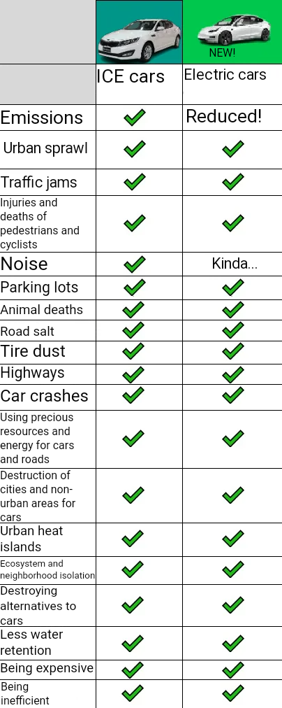
Because the infographic isn’t comparing cars to other forms of transit. It’s comparing one type of car to another. Electric cars are incredibly efficient, for what it is.
this entire chart is invalid in terms of it though, as half of it is comparing just basic traits of cars as a whole, I believe that was the point of the chart(at least in the way OP is using it). It’s intent is to try and persuade people away from cars, but it does a poor job doing so since it lacks an actual decent alternative in the chart. I think it would be more accepted if they added it in comparison to alternatives such as rail (but ironically that system also shares similar traits to cars).


Because the infographic isn’t comparing cars to other forms of transit. It’s comparing one type of car to another. Electric cars are incredibly efficient, for what it is.
It’s a meme, it absolutely is comparing both kinds of cars to other modes of transport.
this entire chart is invalid in terms of it though, as half of it is comparing just basic traits of cars as a whole, I believe that was the point of the chart(at least in the way OP is using it). It’s intent is to try and persuade people away from cars, but it does a poor job doing so since it lacks an actual decent alternative in the chart. I think it would be more accepted if they added it in comparison to alternatives such as rail (but ironically that system also shares similar traits to cars).